Replicon
UX/UI Design and Visual Design System for Replicon
Overview
Replicon is an award-winning Time Intelligence platform offering enterprise solutions for time management, including time and attendance, client billing, and project tracking.
I was hired as Principal UX/UI Designer and Visual Design System Lead to establish Replicon's first UX/UI design practice and overhaul the product's user interface and brand identity.
My role involved creating a modern, cohesive design across the product, and developing a visual design system that aligned with the SAAS architecture.
My Role
In this role, I functioned as a hands-on design leader, actively contributing to design tasks while guiding the overall visual design direction.
As Principal UX/UI Designer and Visual Design System Lead, I was responsible for:
- Brand Direction: Shaping the visual identity and brand guidelines.
- UI Design: Collaborating with Co-CEOs, Engineering, Marketing, and Product managers to identify needs, and design an intuitive and visually appealing design system based on best practices in user-centered design, brand design principles, and design thinking methodology.
- Interaction Design: Designing seamless user interactions.
Tools and Technologies
- Adobe Illustrator
- Adobe Photoshop
- OmniOutliner
- Excel
- Text Edit
Challenges
The main challenges included:
- Establishing a consistent brand identity across platforms.
- Designing user-friendly interfaces.
- Integrating the new TimeClock product with the Timesheet application.
- Aligning brand symbolism and language across marketing, branding, and product design.
Outcome
The redesign resulted in:
- A cohesive brand identity build on a strong design rationale foundation.
- A flexible design system based on best practices in HCI, visual design, form design, mobile UI, and branding and identity core principles.
- Improved user engagement and satisfaction.
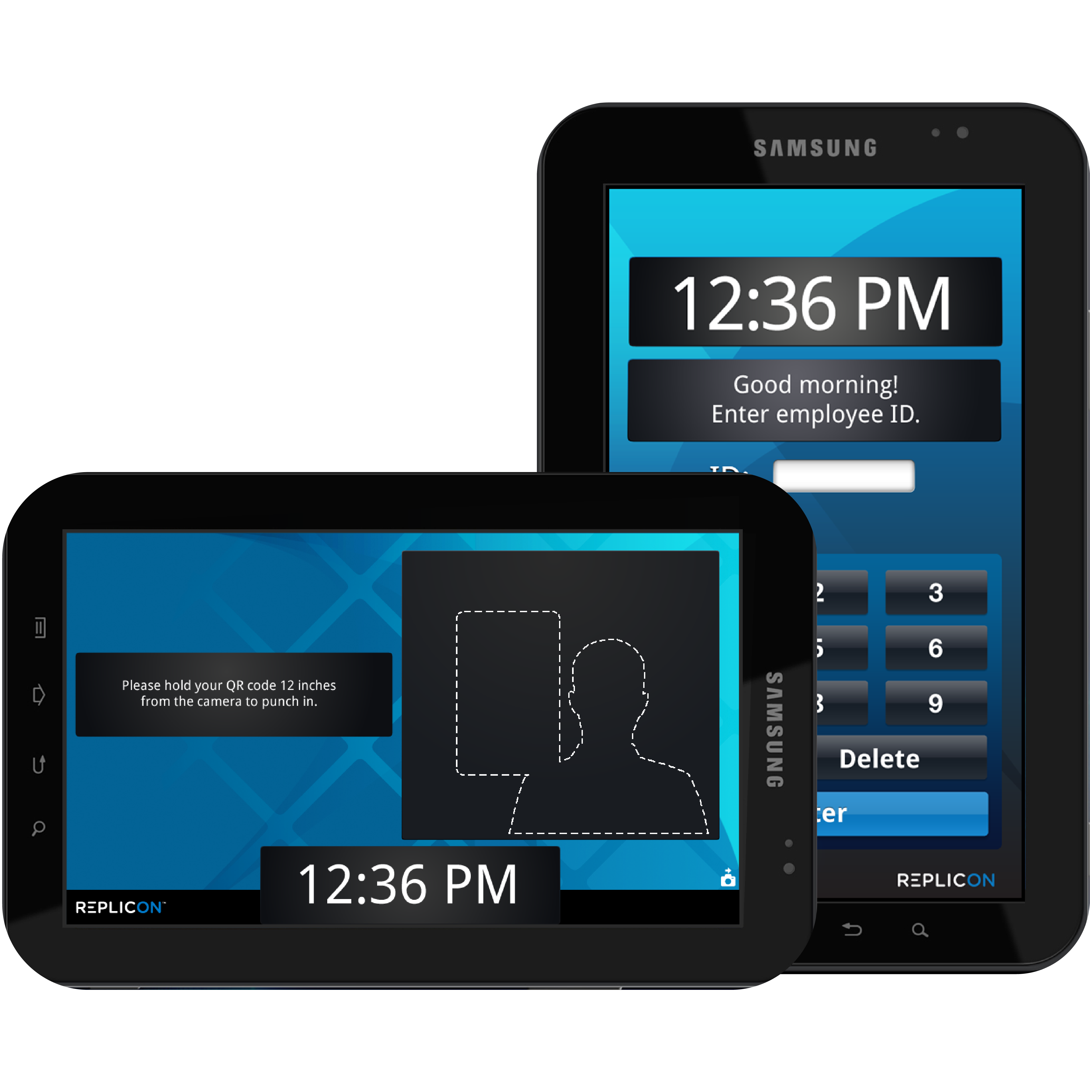
- Successful launch of a new TimeClock tablet device.
- Successful launch of a new iOS mobile app.
Key Takeaways
This project reinforced the importance of:
- Visual consistency across platforms.
- A user-centered design approach.
- Collaboration between UI design, branding, and marketing.
Additional Contributions
- Design Rationale and System Integration: Introduced best practices, created a semantic color palette and a comprehensive design system for visual feedback and consistency, enhancing the user experience and facilitating the cohesive integration of new features and products.
- Information Architecture: Continuously iterated to align:
- Taxonomy across the product ecosystem
- Brand system language
- Application micro-conversational UI language
- Marketing language
- Creative Direction and Design Rationale: Provided an ongoing solid foundation to the redesign by establishing design rationale based on design principles and best practices in:
- Form Design: Ensured clear and efficient data entry through well-designed user interfaces that minimize errors. This involved proper labeling, intuitive layouts, and appropriate use of form elements.
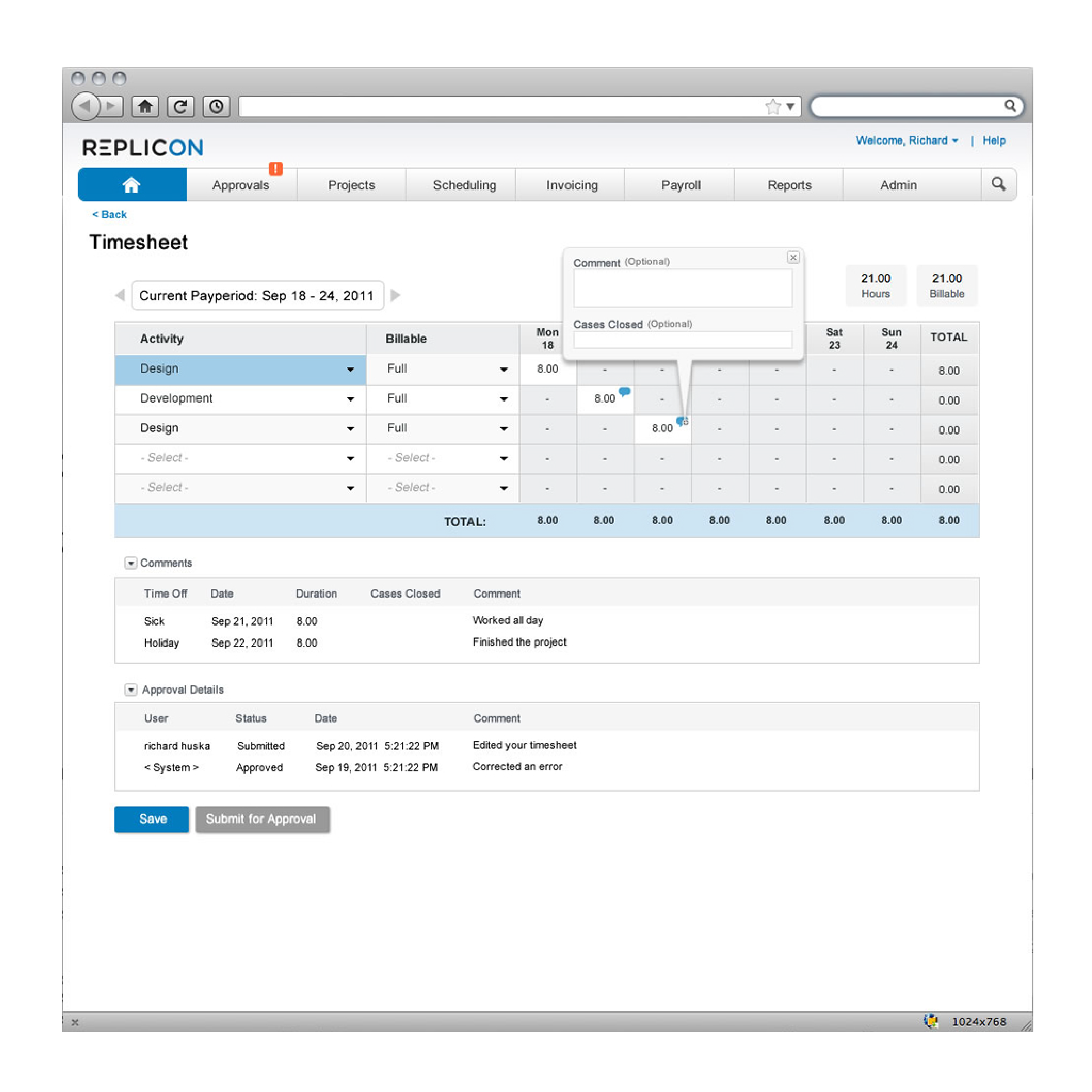
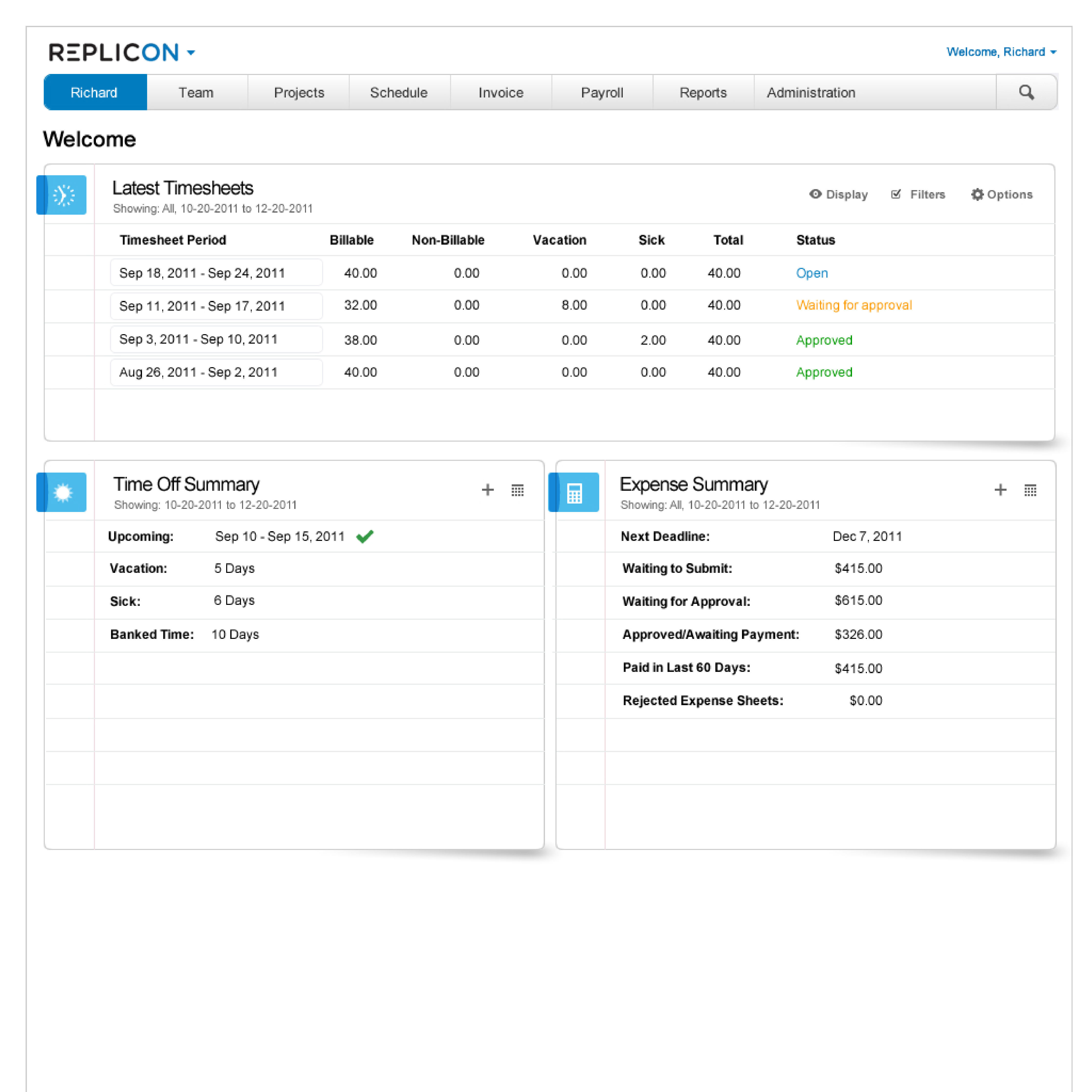
- Cognitive Load: In a daily use, highly configurable enterprise time tracking system, the interface can become dense with information. But, there are daily use cases where density and cognitive load preference are relative to the daily use by the user. For example, a Manager who prefers a comprehensive information dashboard view into their system. I mapped to the use case, and provided design guidance.
- Visual Pacing: Arranged elements on the screen to guide the user's eye and create a sense of order and flow. Whitespace, typography variations, and visual cues like icons and illustrations were used to achieve this.
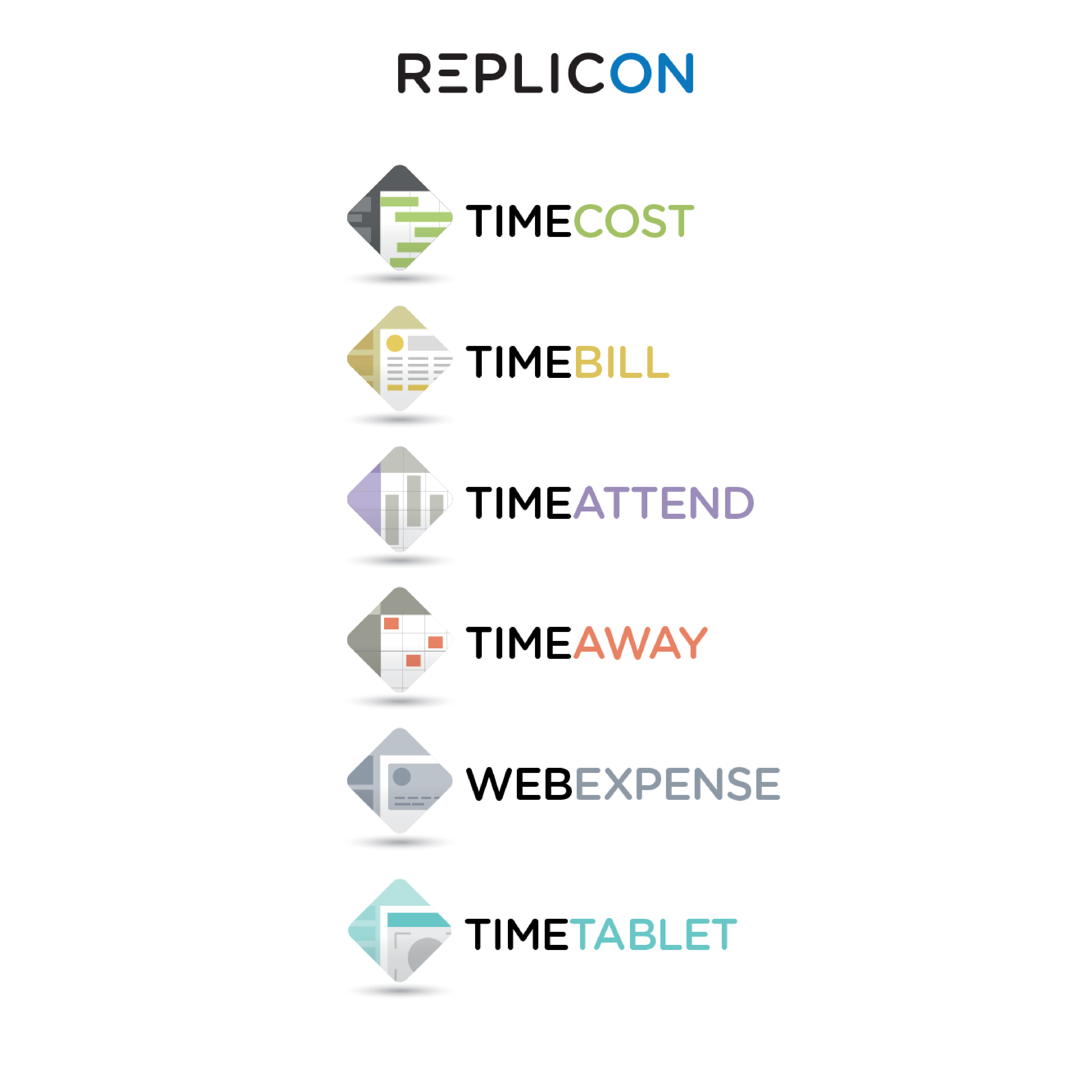
- Brand Symbolism and Language: Established a consistent visual language that aligned with the Replicon brand identity. Logos, colors, typography, and the language used within the applications all reflected the brand voice and shared the same definitions for iconography.
- Microconversational Design: Introduced the concept of the application as a conversation between the user and interface during interaction.Introduced the concept of using microcopy to create a conversational feel within the application. This involves crafting clear and concise text messages that guide users, provide feedback, and mimic a natural conversation during interaction.
- Semantic Color Palettes: Reserved colors in the UI that have inherent meaning and supported the overall information hierarchy. For example, red used for error messages or warnings.Reserve colors. Use green for success messages, blue for system messages, yellow for warning messages, and red for error messages to conform with convention.
- Visual feedback Mechanisms: Employed visual cues to inform users about the outcome of their actions. Examples included progress bars, loading indicators, and confirmation messages.
- Mobile Gestural UI: Focused on designing user interactions specifically for touchscreens, utilizing gestures like swiping, tapping, and pinching to control the interface. This ensured intuitive interaction on mobile devices.
- Gestalt Principle of Closure: Leveraged the human tendency to fill in missing information. By using negative space or partially hidden elements, we created a sense of familiarity and enhanced memorability of the logo mark.
- Gaze Cueing: In brand photography, people tend to follow a person's eye path. Strategically placed visual elements like icons or arrows to subtly guide the user's attention towards important information or interactive elements within the interface.
- Brand POV: Established a strategic editorial point of view that enhances human trust factors in the brand’s marketing language and user interface. Applied this principle to align the brand design and language, maintaining and elevating trust, and used it to form the rationale behind strategic design decisions.
- Accessibility: Highly accessible = highly usable, and has an added by-product of scoping down design work.
- Form Design: Ensured clear and efficient data entry through well-designed user interfaces that minimize errors. This involved proper labeling, intuitive layouts, and appropriate use of form elements.
- Team Building: Assisted in hiring and mentoring designers.
- Asset Library: Created and maintained for brand consistency.
- Cross-Functional Collaboration: Collaborated closely with Engineering and Co-CEOs to iteratively redesign the highly configurable enterprise time tracking solution, and create a new tablet and mobile application.
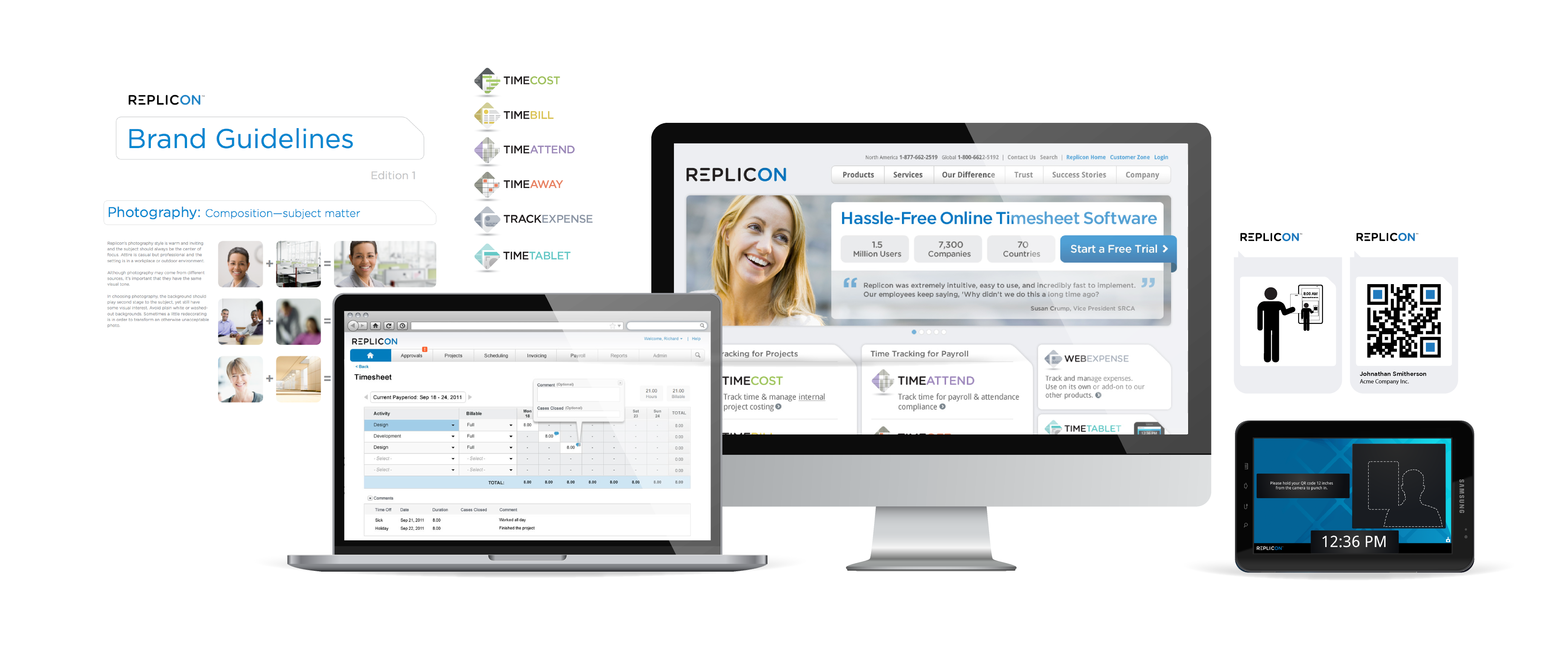
- Replicon Brand Guidelines: (pdf) Hands-on directed the design rationale for UI and brand elements, emphasizing persuasion and trust elements. Created a subsystem visual language with logos and palettes for sub-products, ensuring cohesive brand extensions.
In designing the Replicon logo, I employed the Gestalt principle of closure to enhance visual recall and engagement. By deliberately omitting certain parts of the letter, I leveraged the human brain’s natural tendency to fill in gaps based on familiar patterns and schemas. This technique not only creates a unique and visually appealing logo but also triggers viewers’ cognitive schema processes, making the logo more memorable. The principle of closure, as part of the broader Gestalt psychology framework, plays a role in creating designs that resonate deeply with audiences by engaging their mental shortcuts and improving brand recall.
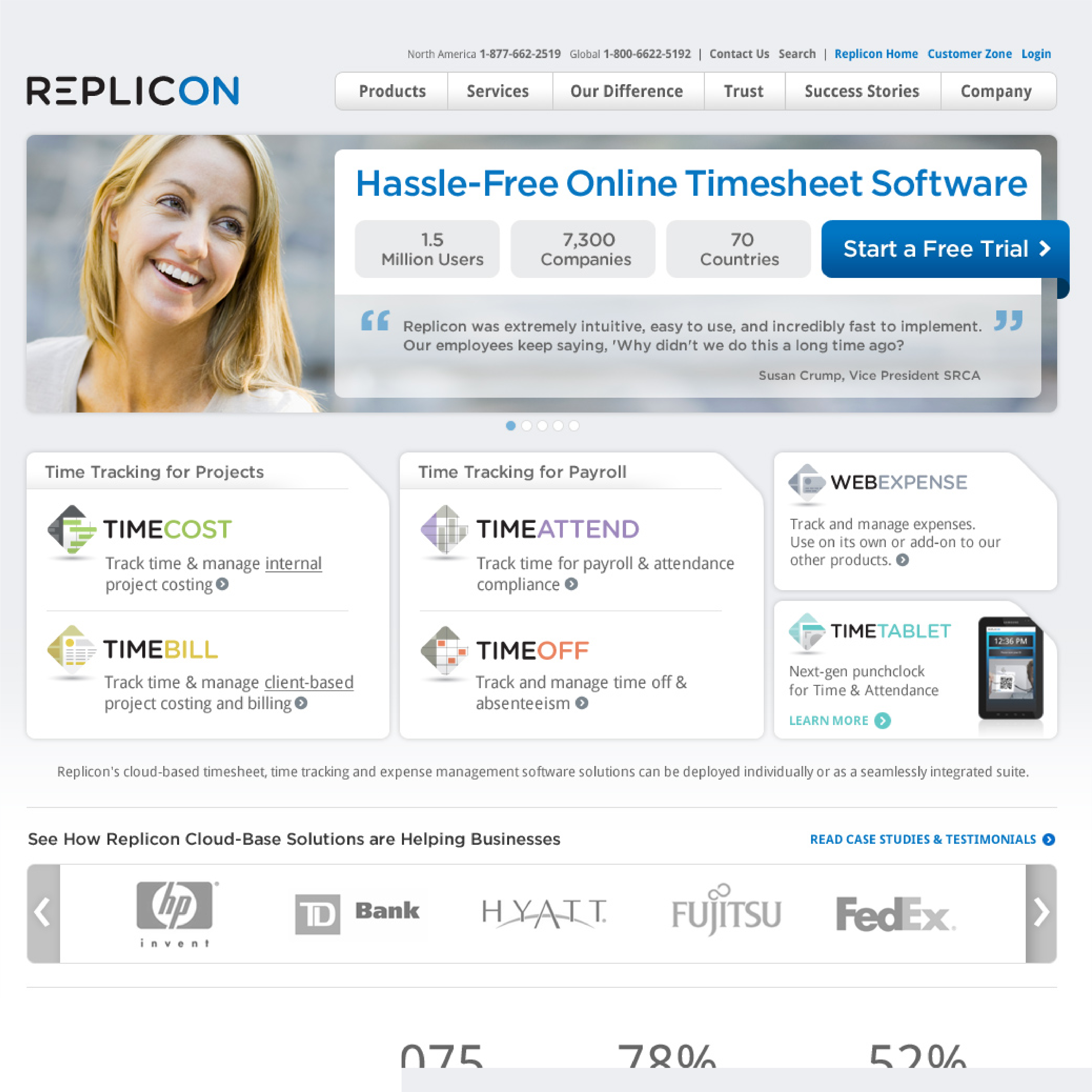
The identity system extended to each Replicon product.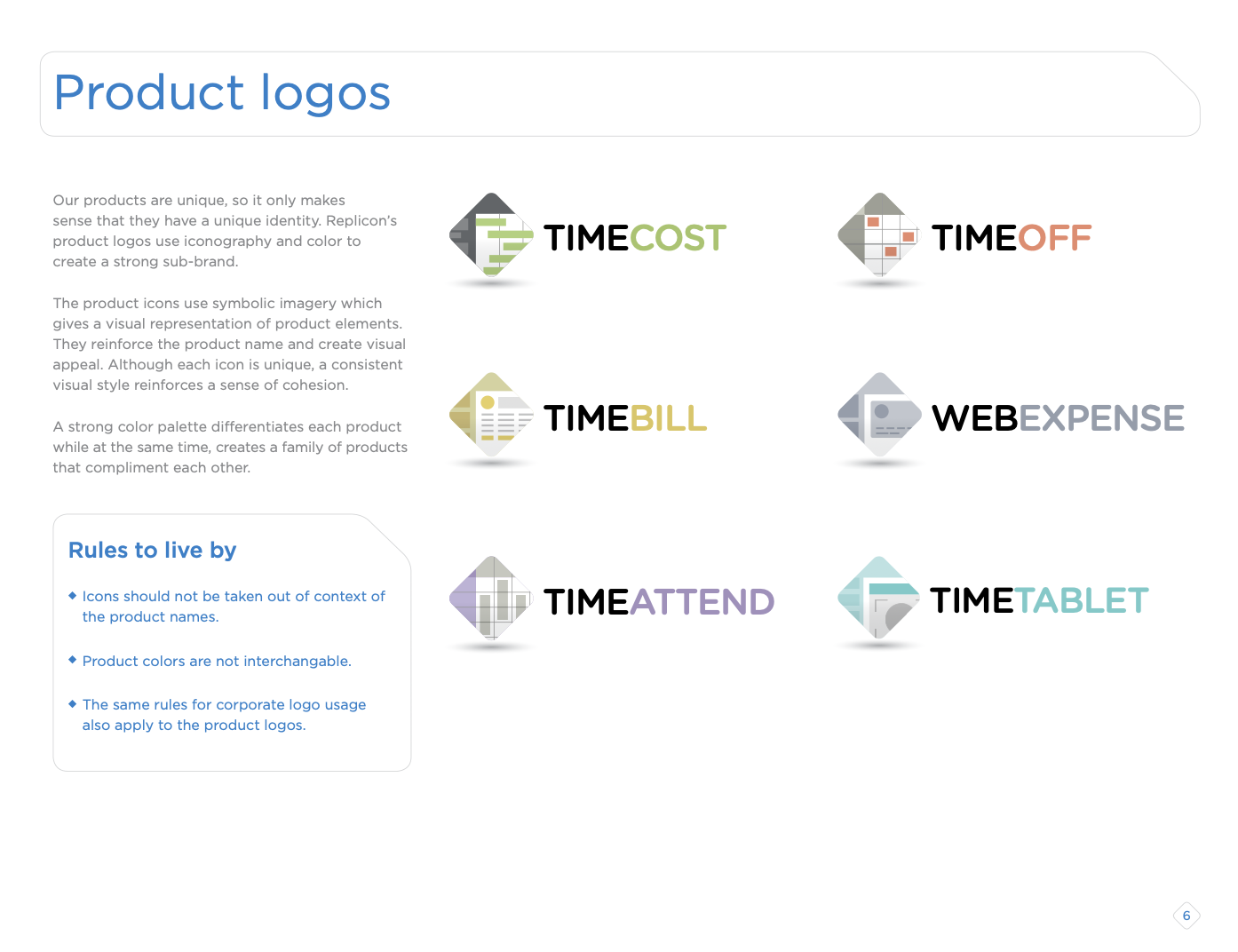
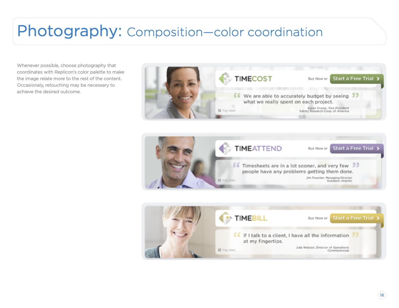
 In the Replicon brand redesign, we incorporated the gaze cueing technique into the brand photography guidelines, to enhance visual hierarchy and guide user attention effectively.
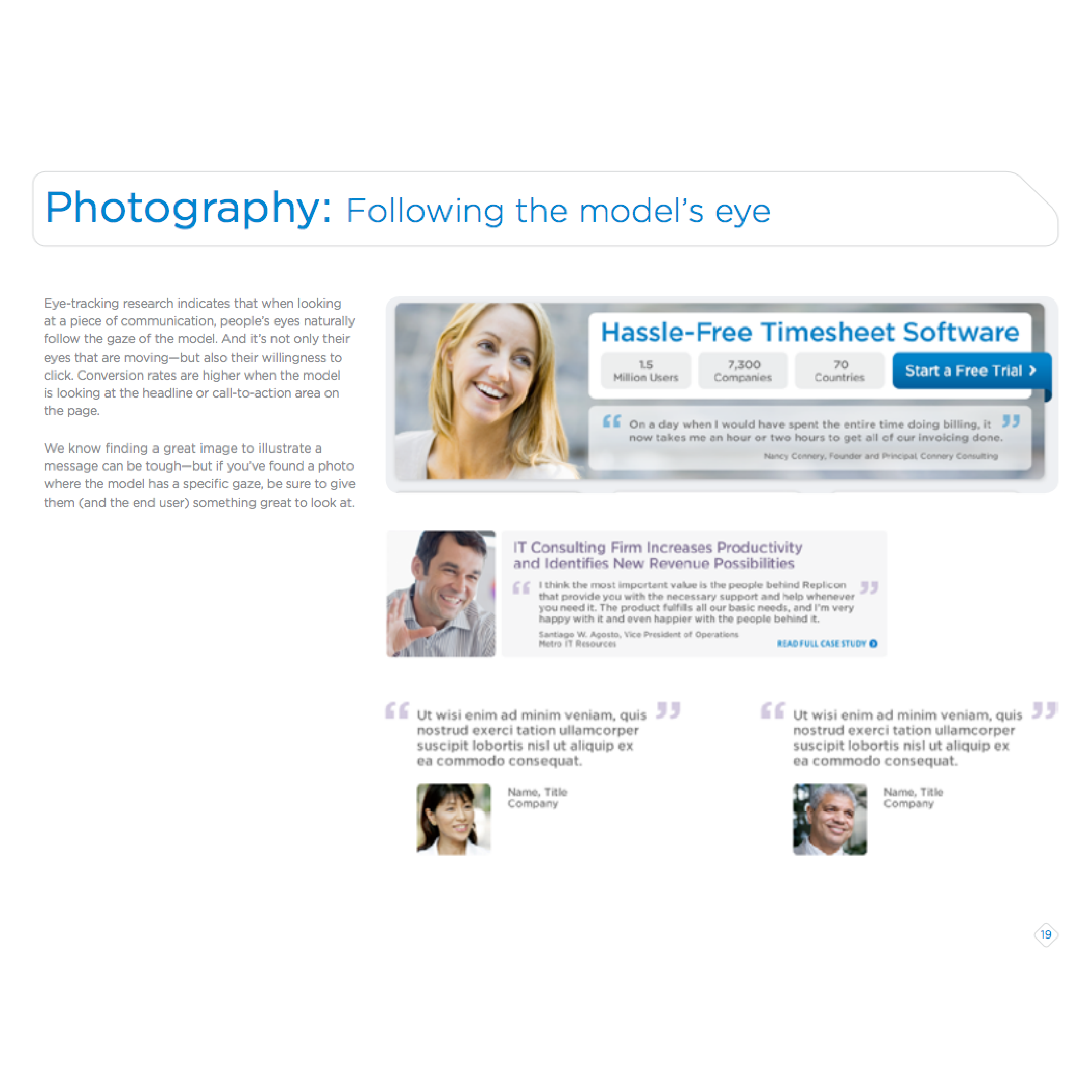
By strategically positioning the model’s gaze towards our key headline, we leveraged the natural human tendency to follow the direction of others’ eyes.
This approach influences the eye path, and the viewer’s attention is immediately drawn to the most important information, enhancing both engagement and recall. Gaze cueing, grounded in psychological principles, plays a role in creating intuitive and compelling visual experiences that effectively communicate the message.
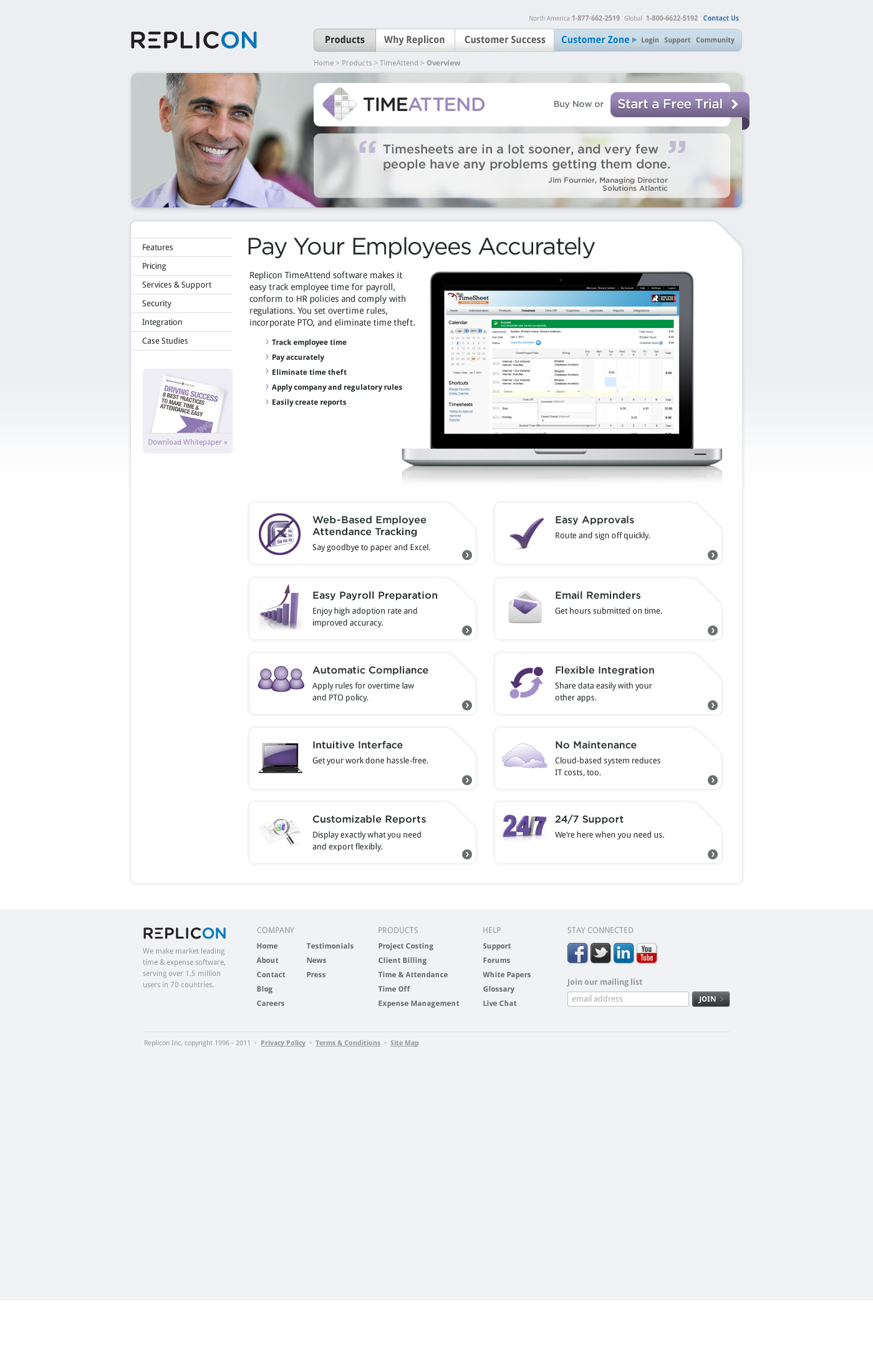
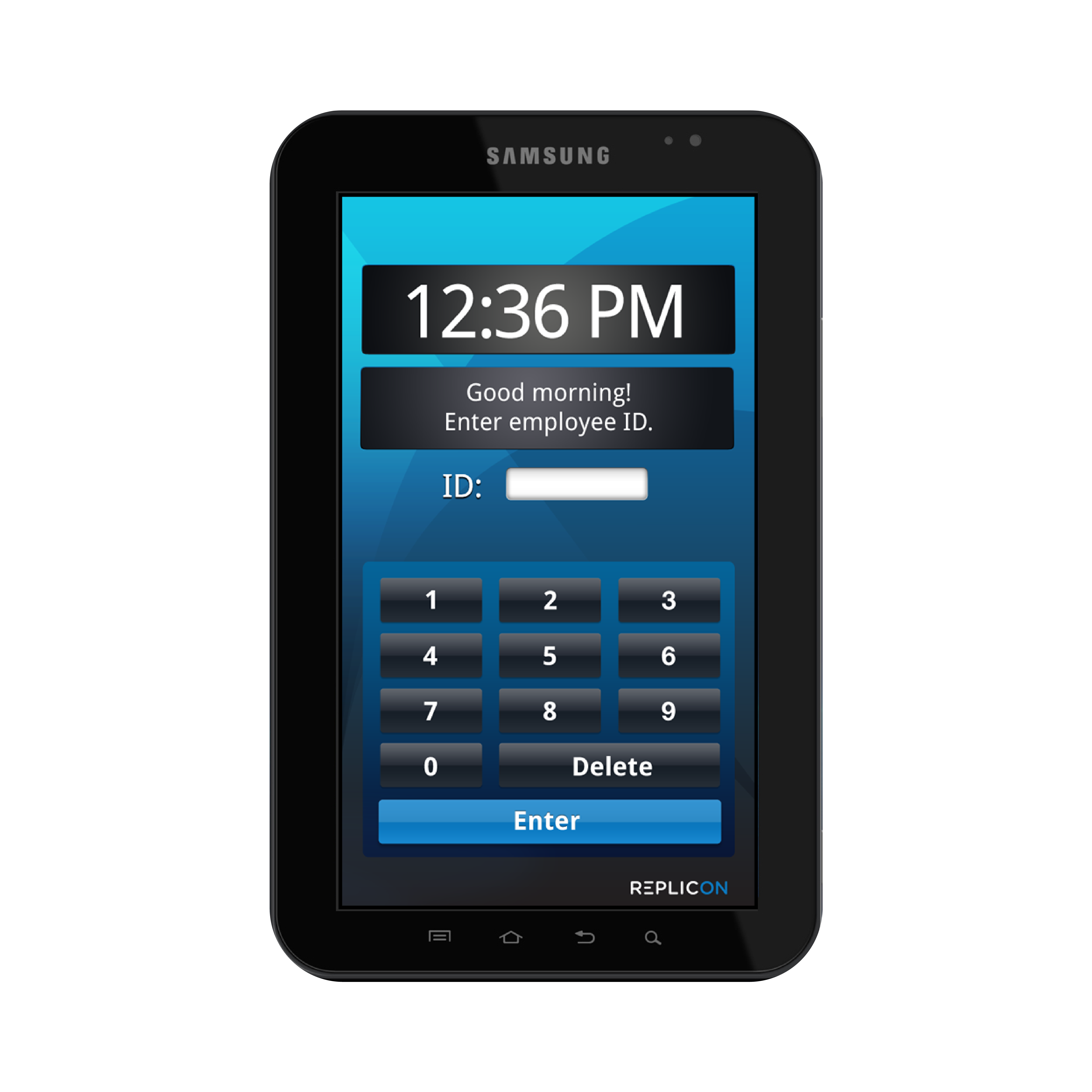
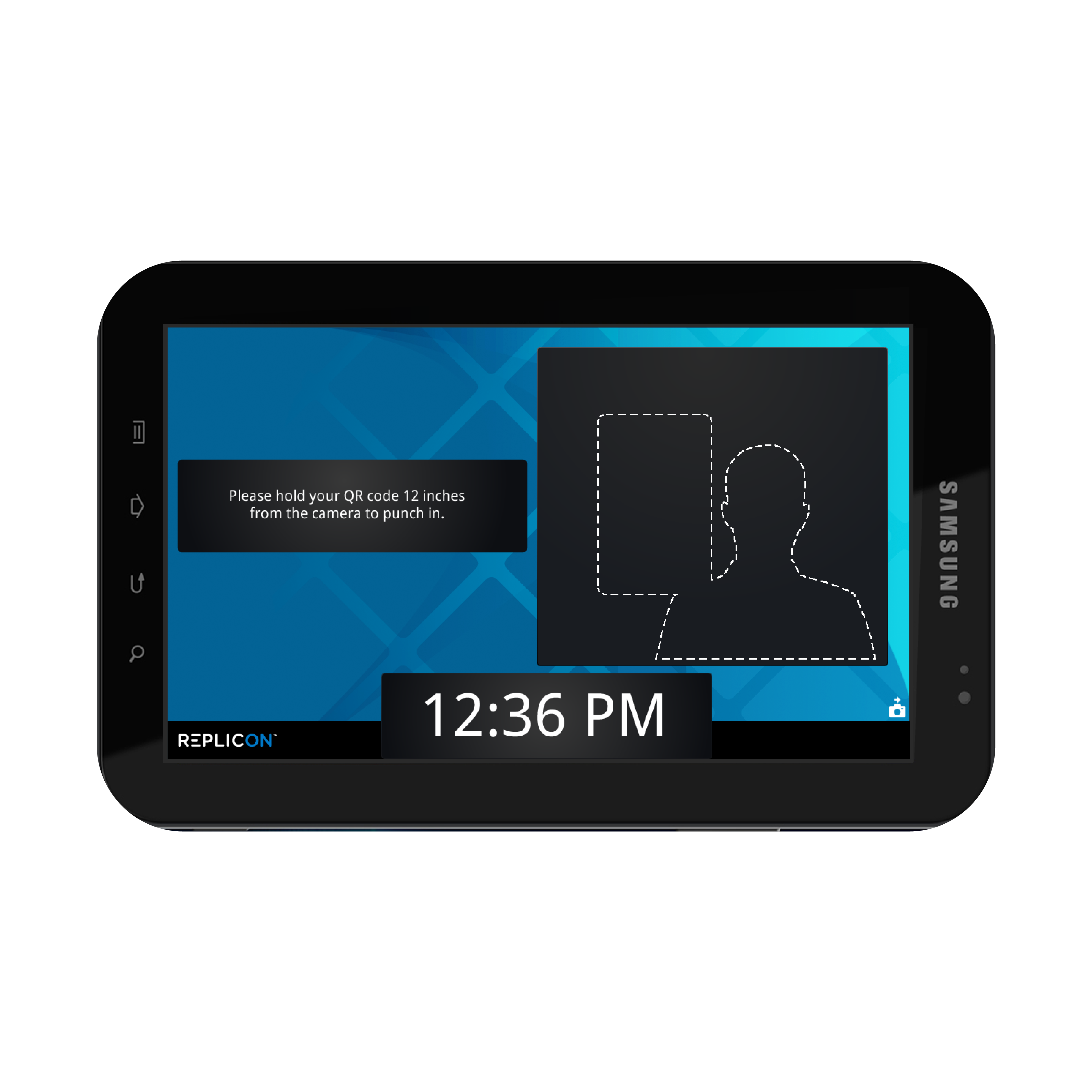
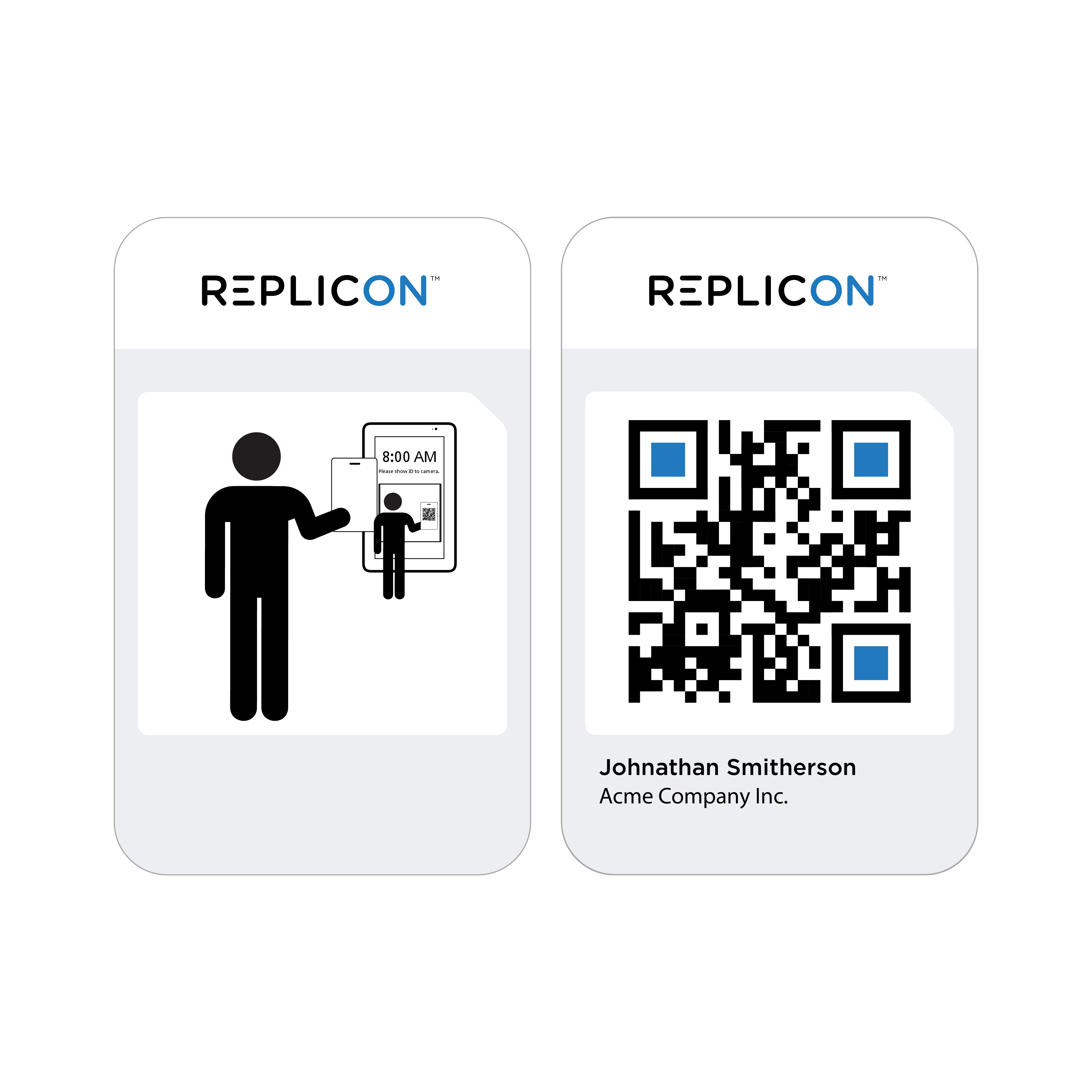
- Replicon TimeClock: Designed a kiosk-style tablet UI, in collaboration with PM and Engineering, for secure attendance tracking. Integrated user feedback and best practices for Android and mobile UI design. Ensured the new brand elements were iterated into the new product interface design.
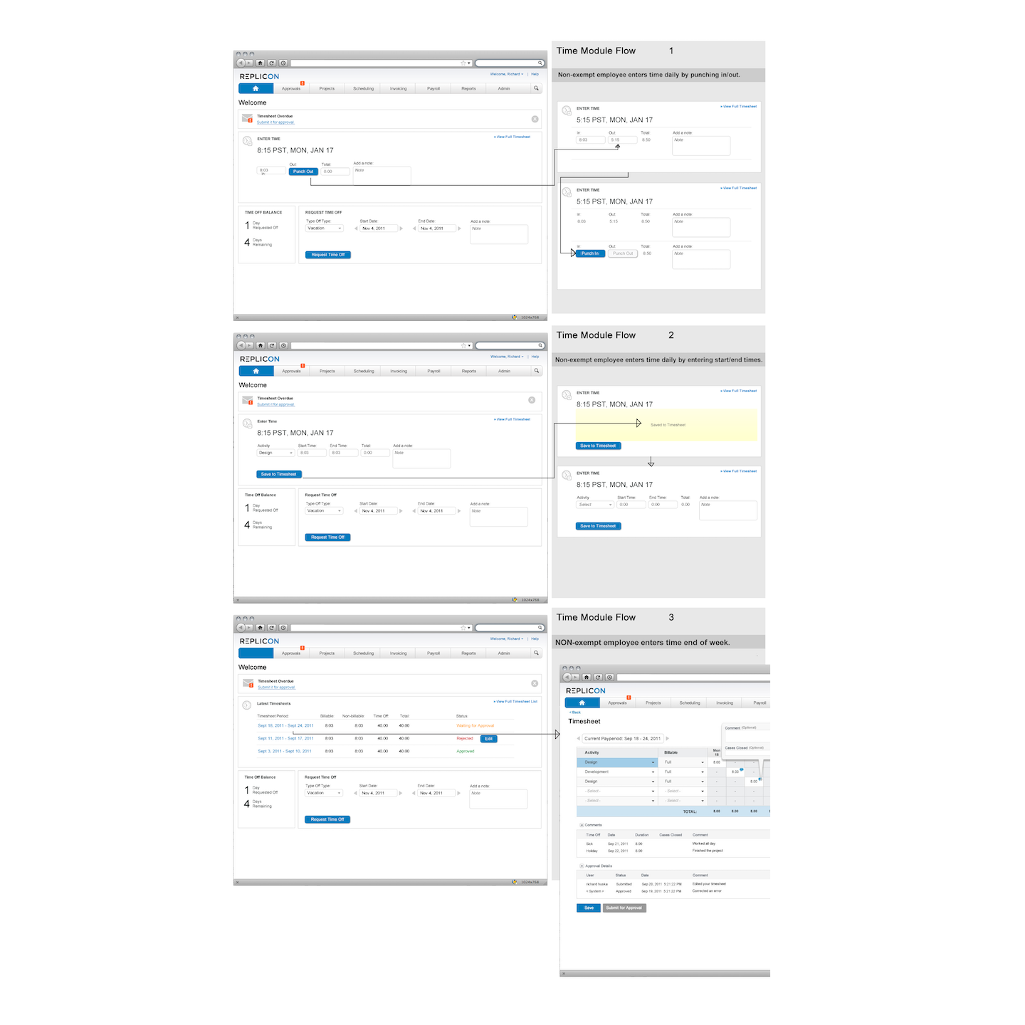
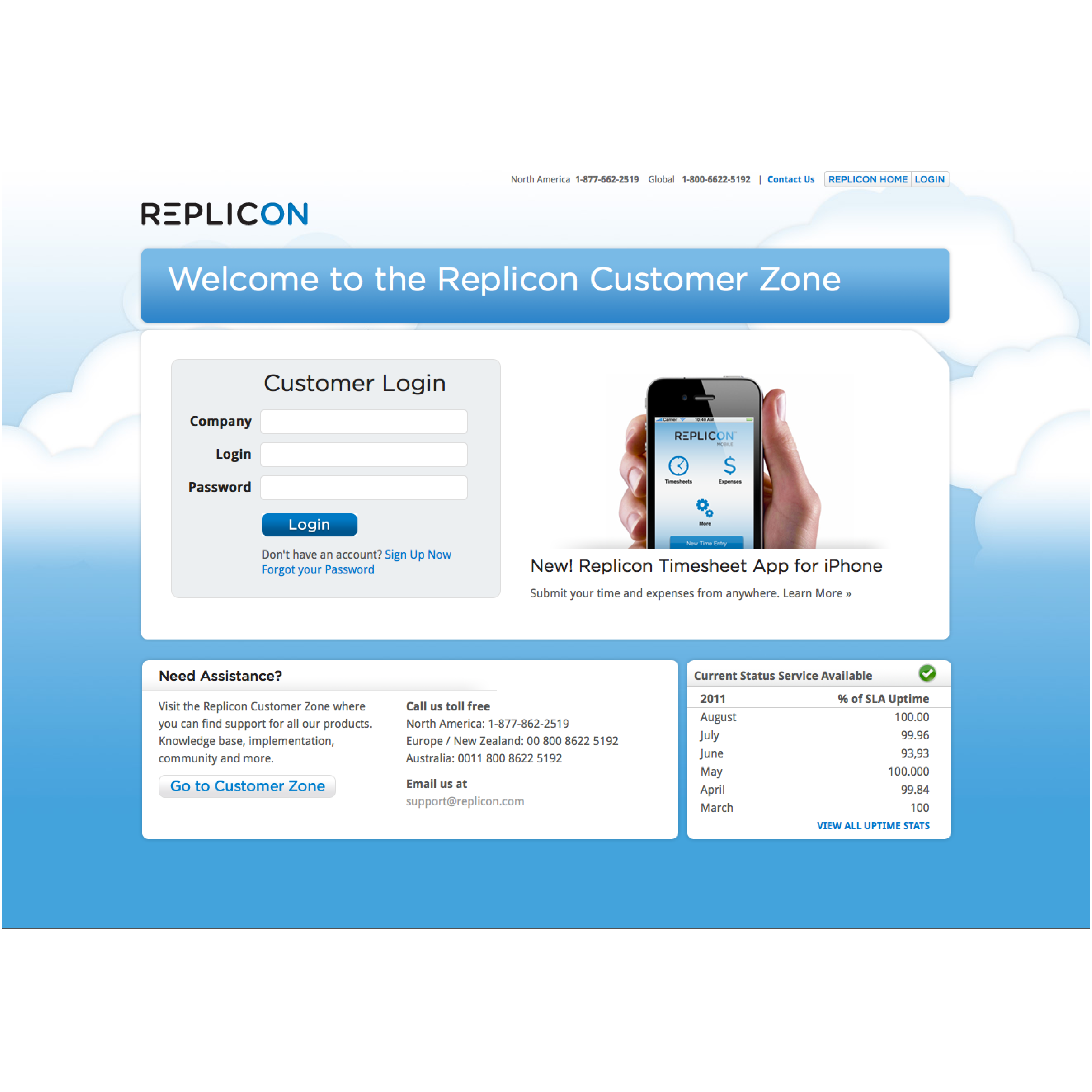
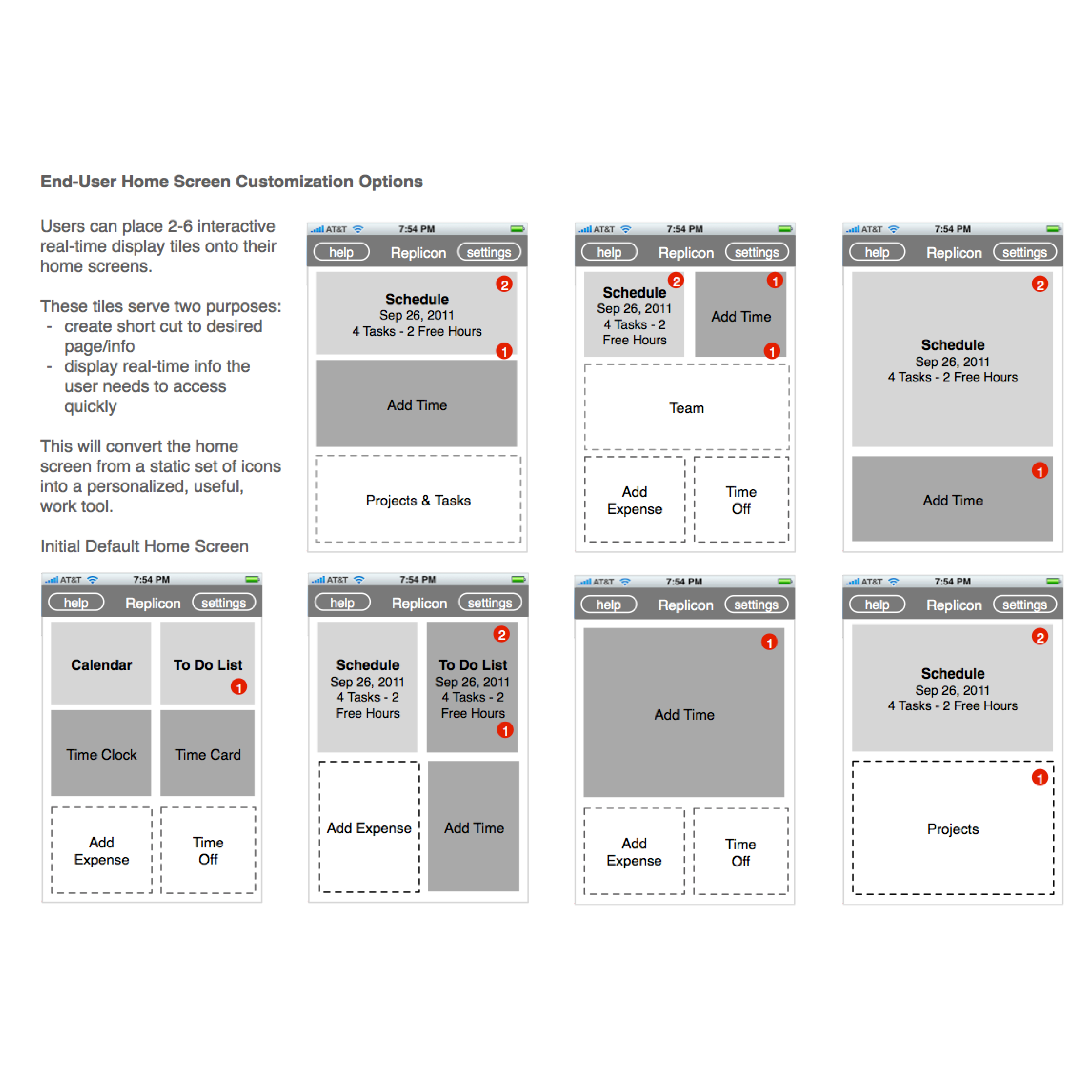
Screenshots, Artifacts, Wireframes and Designs