CloudOn
UI Redesign. Acquired by Dropbox.
Overview
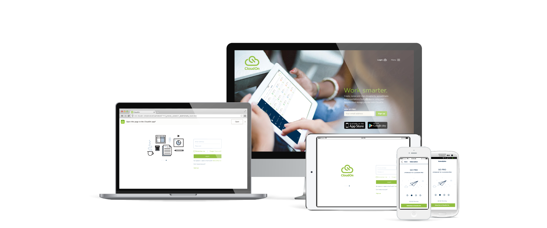
As part of the product design team, I designed UI prototypes and visual designs for CloudOn's app suite, which included an iPad app, a mobile-first responsive web app, and an Android mobile app, creating a unified user experience across multiple devices.
My Role
Lead UI/UX Designer, responsible for creating wireframes, prototypes, and final visual designs.
Tools and Technologies
- Confluence
- Adobe Illustrator
- HTML/CSS/JS
Outcome
The project resulted in a web app and native apps that significantly improved user engagement and satisfaction. The app received positive feedback for its intuitive design and seamless performance.
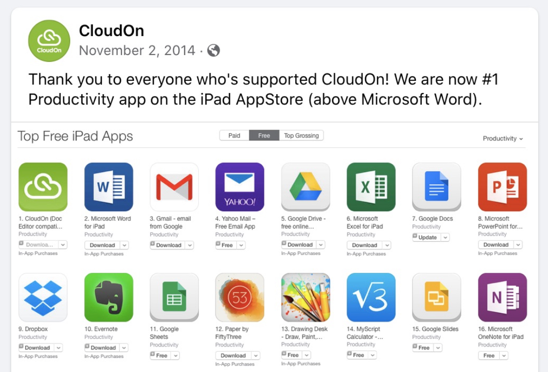
CloudOn reached number 1 in the App Store and was subsequently acquired by Dropbox.
Key Takeaways
This project reinforced the benefits of benchmarking, best practices, and responsive design principles.
Additional Contributions
- External Facing Marketing Website Updates: Designed and updated the marketing website visuals to align with brand guidelines.
- Infographics: Created an infographic style to visually represent data and the benefits of using CloudOn.
- Notification Systems: Designed notification systems to keep users informed and engaged.
- Marketing and Promotional Materials: Developed engaging promotional content for product launch and updates.
- User Onboarding and Tutorials: Designed user onboarding flows and created tutorials to assist users.
- User Interface for Content Creation Tools: Developed UI for content creation tools, focusing on a mobile-friendly, cloud-enabled experience.
Design Rationale and Color Palette
To enhance the user experience and maintain visual consistency, I introduced a semantic color palette in addition to the interface brand and UI color palette. This approach provided better visual feedback and enabled a clear design rationale for brand elements within the constraints of iOS Human Interface Guidelines components, Android Interface Components, and web responsive app components, helping users distinguish different elements and states within the app.
Cloud-based file systems required a robust notifications system across the application suite. I designed notifications that conformed to the best practices of each platform and documented the system for dev handoff and as a style guide repository, using Confluence.
Micro-conversation moments were also integrated to enhance user interactions and provide timely feedback across the app. These moments included inline notifications and contextual cues to improve the overall user experience.
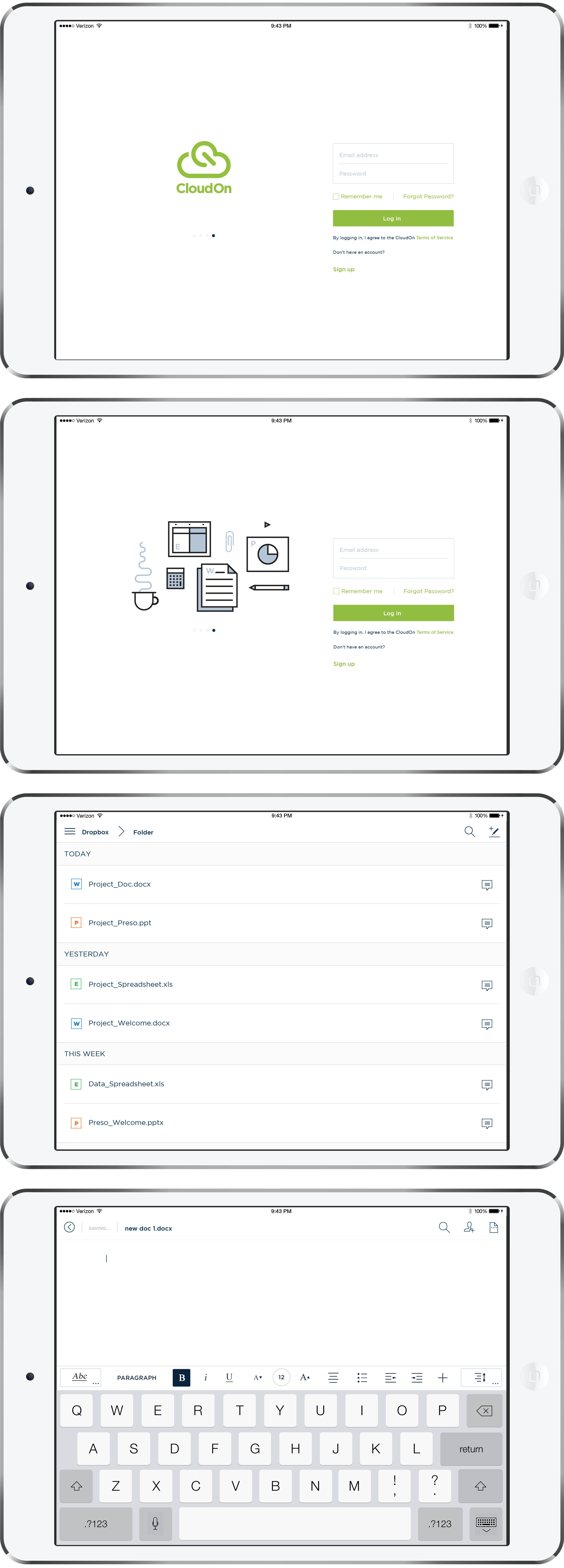
iPad App Key Screens
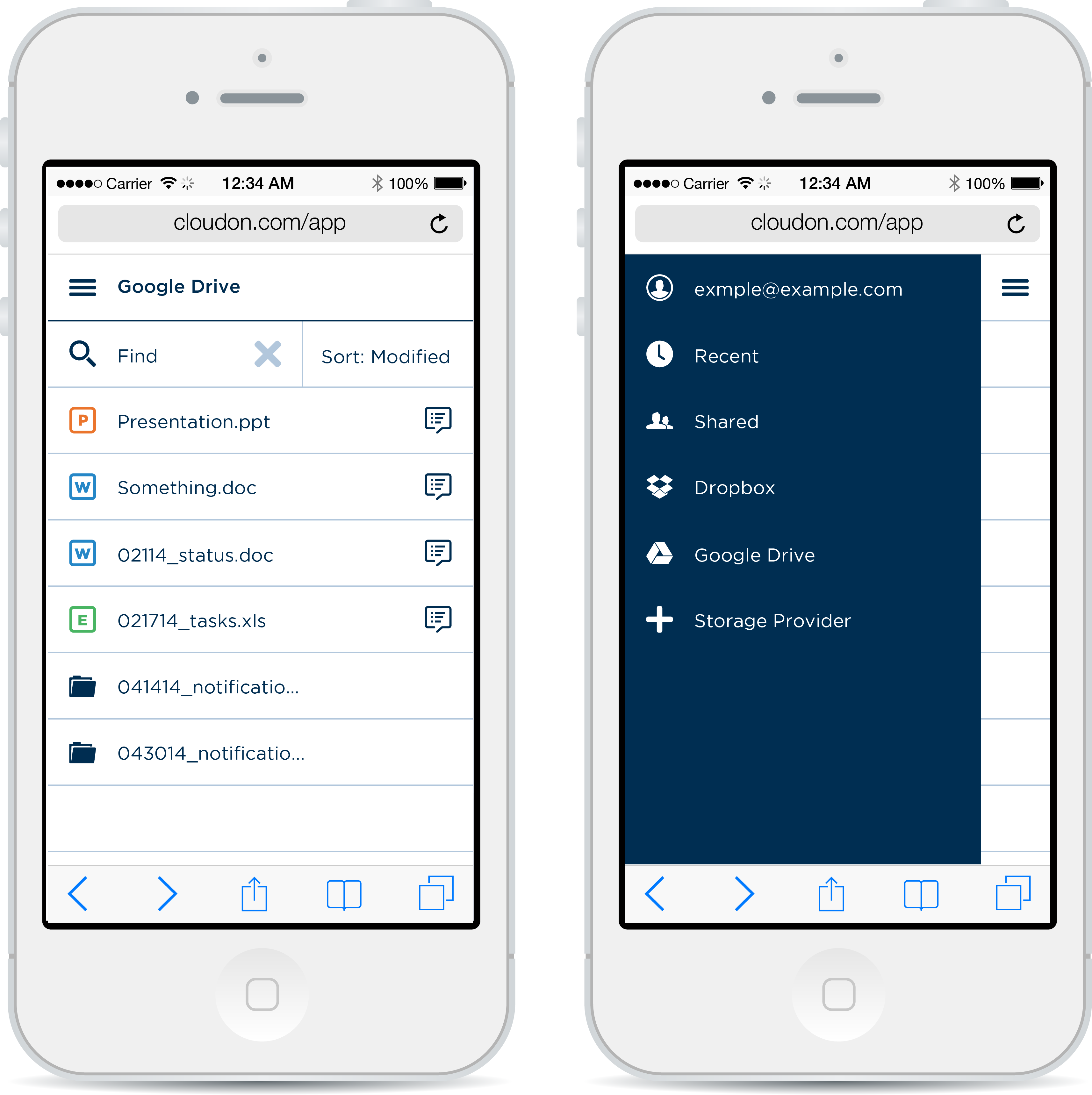
Web App: Mobile Threshold View
File Manager and Navigation Drawer
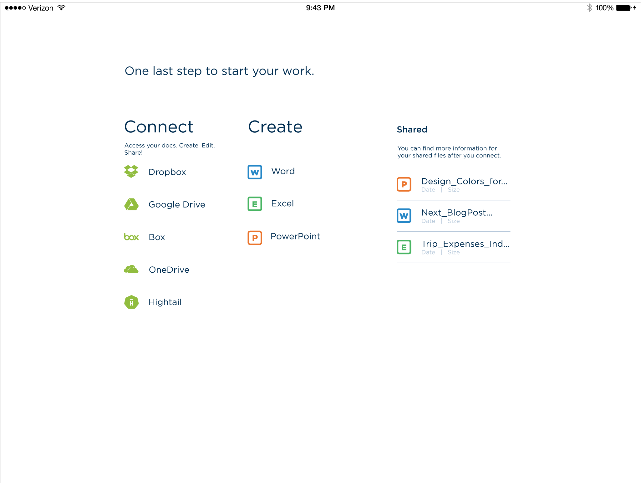
iPad App: FTUX and Onboarding
